Behind the build
4 min read
Behind the build: Why mobile-first thinking changes project outcomes
Why mobile is no longer a secondary experience
One of the biggest shifts in digital experience design over the last few years is that mobile is no longer a secondary consideration.
For many users, it’s the primary experience.
Whether people are registering for events, accessing training, reviewing dashboards or interacting with platforms on the move, mobile has become the default interaction point across a huge range of digital journeys.
Yet many experiences are still designed desktop-first.
That usually creates problems surprisingly quickly.
When desktop experiences don’t translate to real mobile behaviour
We regularly see digital platforms that function perfectly well on larger screens but become noticeably more difficult to use once translated into real mobile behaviour.
Navigation becomes heavier, interactions require too much effort and users are forced to think harder than they should while moving through the experience.
The challenge often isn’t functionality.
It’s friction.
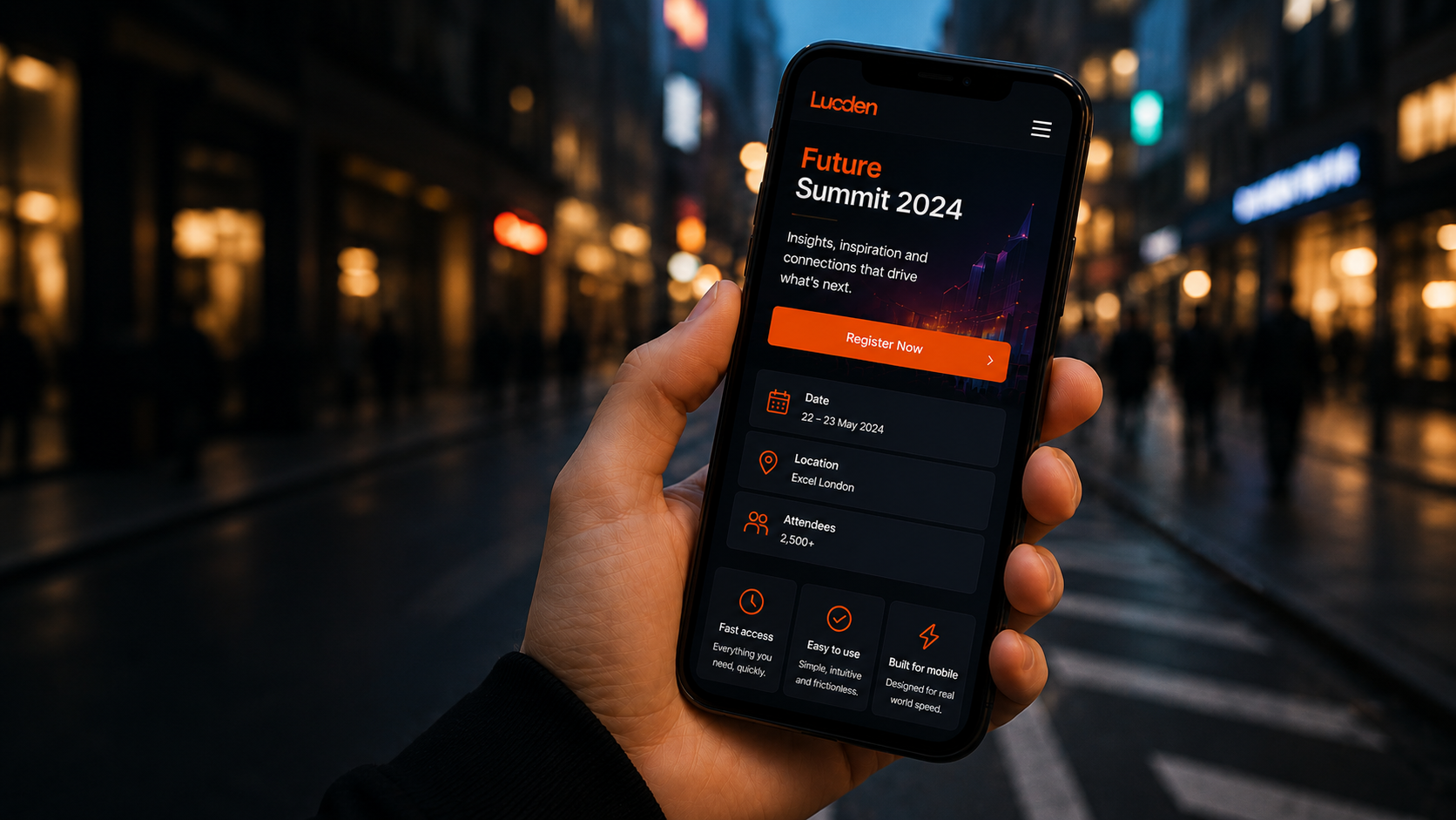
We recently worked through a project where the desktop experience initially appeared highly successful. The interface was polished, feature-rich and technically robust, but once the journey was reviewed through a mobile-first lens, several issues became much more obvious.
Interaction paths were too long, key actions required unnecessary steps and certain content structures created cognitive overload on smaller screens.
Designing around how mobile users actually behave
That’s a common issue across digital projects because mobile users behave very differently.
People are often:
- Multitasking
- Travelling
- Distracted
- Using one hand
- Interacting in short bursts
- Navigating under time pressure
In those moments, speed and clarity become far more important than feature depth.
Our approach focused on simplifying the experience around real mobile behaviour rather than simply adapting desktop layouts responsively.
We looked closely at where friction existed, how quickly users could complete actions and which interactions slowed the journey down unnecessarily.
Why simplicity improves mobile usability
Large sections of the experience were simplified, interaction pathways became shorter and calls to action became clearer throughout the journey.
The overall structure was redesigned to prioritise movement, usability and hierarchy over visual density.
Performance also became a major focus.
Load speed has a huge impact on mobile engagement, particularly in environments where connectivity may be inconsistent or attention spans are already limited. Simplifying the interface often improved both usability and performance at the same time.
Importantly, the goal wasn’t to reduce capability.
It was to reduce effort.
That distinction matters enormously within mobile UX.
Designing mobile experiences that feel effortless
The strongest mobile experiences are rarely the ones with the most functionality.
More often, they’re the experiences that allow users to complete important tasks quickly and confidently with as little friction as possible.
Good mobile design should feel fast, obvious and almost invisible. Users shouldn’t have to stop and work out how the interface behaves. The experience should guide them naturally through the journey without demanding unnecessary attention.
Following the refinement process, the mobile journey became significantly faster, cleaner and easier to navigate. Users were able to complete key actions more efficiently and engagement improved because the experience itself required less effort to use.
It reinforced something we see repeatedly across digital experience design:
Mobile-first thinking isn’t simply about responsive layouts.
It’s about designing around real-world behaviour.
That’s usually where better digital experiences begin.
Summary
Mobile-first design is about far more than making layouts responsive. It’s about understanding how people actually behave on mobile devices and reducing friction throughout the experience.
Simplifying interaction paths, improving hierarchy and prioritising speed and clarity can often have a much bigger impact on engagement than simply adding more functionality to mobile experiences.
Working on something similar?
Feel free to drop the Lucden team a message on hello@lucden.com or call 0207 101 3268. Always happy to chat ideas through.