Behind the build
4 min read
Behind the build: Why focused content and structure matter more than volume
When event microsites become overloaded
One of the most common problems with event microsites is that they gradually become overloaded with information.
Additional pages get added. Sponsor content expands. More navigation options appear and what may have originally started as a simple event destination slowly evolves into something far more complicated to navigate.
The intention is usually positive.
Teams want visitors to have access to everything they might need. But in practice, many event microsites end up trying to do too much at once.
That’s often where engagement starts to suffer.
Why clarity matters more than content volume
We recently worked through an event microsite project where the biggest challenge wasn’t visual design or technical capability — it was clarity.
The original structure contained a large amount of information, multiple competing calls to action and navigation pathways that made the experience feel heavier than necessary.
Nothing within the site was technically wrong.
But from a user perspective, it took too much effort to understand:
- What the event actually was
- Where important information lived
- What action to take next
- How to move through the site confidently
That’s a major issue within event environments because users are often visiting microsites with very specific intent and limited time.
Designing around how people actually use event microsites
Most event users are looking for quick answers.
They may be trying to:
- Register for the event
- Review the agenda
- Access venue information
- Confirm timings
- Find content quickly
- Check logistics while travelling
In those moments, clarity becomes far more important than content volume.
Our approach focused heavily on simplifying the structure of the experience rather than expanding it further. We looked closely at how visitors would realistically move through the microsite, which information mattered most at different stages of the event journey and where unnecessary friction existed within the navigation.
Why stronger hierarchy improves engagement
Large sections of content were consolidated, navigation became more intentional and calls to action were prioritised more clearly throughout the experience.
Importantly, the goal wasn’t to remove useful content.
It was to create stronger hierarchy and focus.
That distinction matters.
Many digital experiences become difficult to use not because there’s too little information, but because everything is competing for attention equally.
Strong microsite design is often less about adding more and more about helping people find what matters quickly.
Guiding users through the experience naturally
This becomes even more important within event environments where users are distracted, multitasking and frequently accessing content from mobile devices.
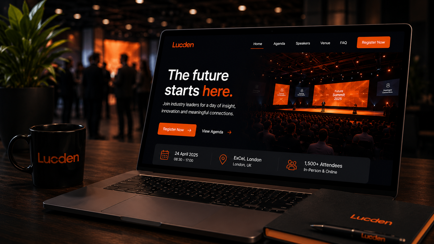
The strongest event microsites usually feel lightweight, obvious and easy to move through. Users should instinctively understand where to go next without needing to think too hard about the structure behind the experience.
Following the restructuring work, the microsite became significantly easier to navigate and engage with. Key user pathways became clearer, important information surfaced more effectively and the overall experience felt calmer and more intuitive despite containing the same core information underneath.
It reinforced something we see repeatedly across digital experience design:
Good event microsites are rarely defined by how much content they contain.
They’re defined by how clearly they guide people through the experience.
That’s usually where meaningful engagement begins.
Summary
The success of an event microsite rarely comes from adding more content or functionality. More often, it comes from creating clarity, stronger structure and intuitive navigation that helps users quickly find what they need.
Reducing friction and improving hierarchy can often have a far bigger impact on engagement than simply expanding the amount of information available.
Working on something similar?
Feel free to drop the Lucden team a message on hello@lucden.com or call 0207 101 3268. Always happy to chat ideas through.