Behind the build
4 min read
Behind the build: Simplifying dashboards and analytics experiences
Why dashboards often become difficult to use
One of the biggest problems with dashboards isn’t usually the data itself.
It’s the way the information is presented.
We regularly see analytics platforms and reporting systems designed to surface as much information as possible at once. Charts, graphs, filters, tables and live data feeds are layered together with the intention of creating visibility — but in practice, many dashboards end up creating the opposite effect.
Instead of helping people make decisions faster, they overwhelm users with complexity.
That’s often where data experiences begin to lose value.
When more information creates less clarity
We recently worked through a dashboard project where the underlying reporting capabilities were already highly advanced.
The platform contained extensive analytics, multiple data sources and detailed performance information across the organisation. Technically, the system was extremely capable.
But from a user perspective, the experience felt mentally heavy to process.
Important insights were competing against secondary information, visual hierarchy lacked consistency and users were spending too much time trying to work out what actually mattered.
That’s a common challenge within analytics and data visualisation projects.
There’s often a tendency to prioritise completeness over clarity.
Designing dashboards around decision-making
Most users don’t need to see everything simultaneously.
They need guidance, prioritisation and structure. They need to understand:
- What requires attention
- What has changed
- What actions should be taken
- Where performance is improving or declining
- Which information matters most right now
Without that hierarchy, dashboards quickly become visually noisy and cognitively exhausting.
Our approach focused less on adding more analytics and more on improving how the information was experienced day to day.
We looked closely at how users interacted with the platform, which decisions they were trying to make and where friction or overload was occurring within the reporting journey itself.
Why hierarchy matters more than volume
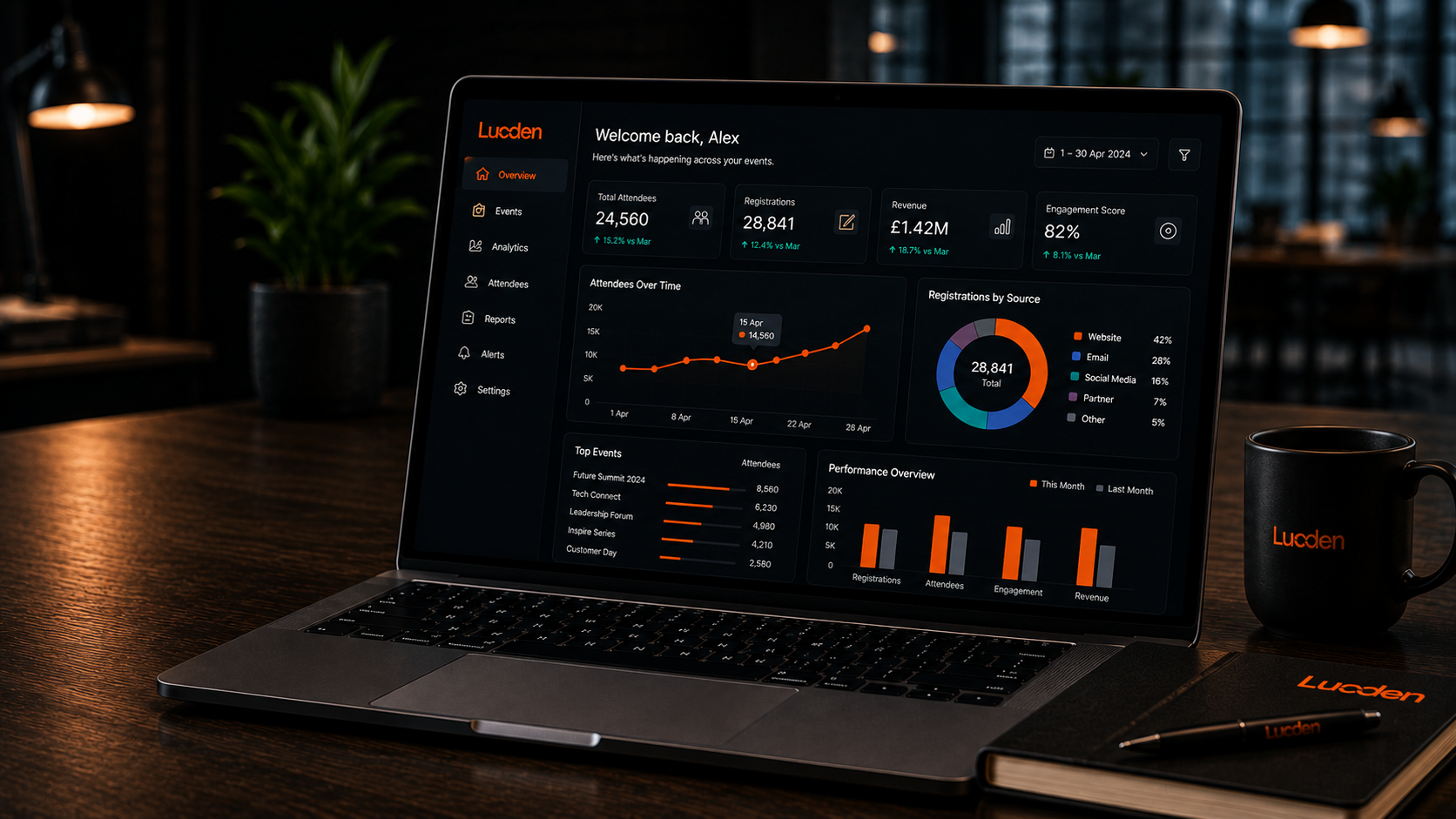
Large amounts of information were restructured into clearer layers of hierarchy.
Key metrics became more visible, supporting data moved into secondary pathways and the overall interface was simplified to create a calmer and more focused experience.
Importantly, the goal wasn’t to reduce the intelligence of the platform.
It was to reduce the effort required to understand it.
That difference matters enormously.
Strong data visualisation is rarely about displaying more information. More often, it’s about helping people identify meaning quickly and confidently without unnecessary mental processing.
Good dashboards should support decision-making rather than distract from it.
Making insights easier to act on
This becomes even more important in environments where users are multitasking, under pressure or reviewing information rapidly throughout the day.
In those situations, clarity and hierarchy often have a far bigger impact than adding additional functionality.
Following the redesign process, users were able to identify key insights significantly faster and move through the reporting experience more naturally. The platform felt cleaner, easier to interpret and more actionable despite still containing the same underlying data underneath.
It reinforced something we see repeatedly across digital experience design:
The value of data doesn’t come from how much information is available.
It comes from how quickly people can understand what matters.
That’s usually where better decision-making begins.
Summary
The effectiveness of dashboards and analytics platforms rarely comes from showing more data. More often, success comes from creating clarity, hierarchy and helping users identify important insights quickly and confidently.
Simplifying reporting experiences and reducing cognitive overload can often have a much bigger impact on usability and decision-making than adding additional features or visual complexity.
Working on something similar?
Feel free to drop the Lucden team a message on hello@lucden.com or call 0207 101 3268. Always happy to chat ideas through.